To finish the data visualisation and communication course from the EPFL extension school, I needed to create something that would b e accepted as a capstone project. I decided to program another shiny app, again using open government data, like for the previous, smaller app. I came across the energy usage of the city of Winterthur, and decided to make energy the topic of the app. Zurich and Basel also publish their energy usage openly, so the app has become a tale of three cities.
After a rather extensive bout of exploratory data analysis – a surprising amount of information can be extracted from a time series with a single data point every 15 minutes! – I wrote the app fairly quickly. You can find the result here, and it looks like this:
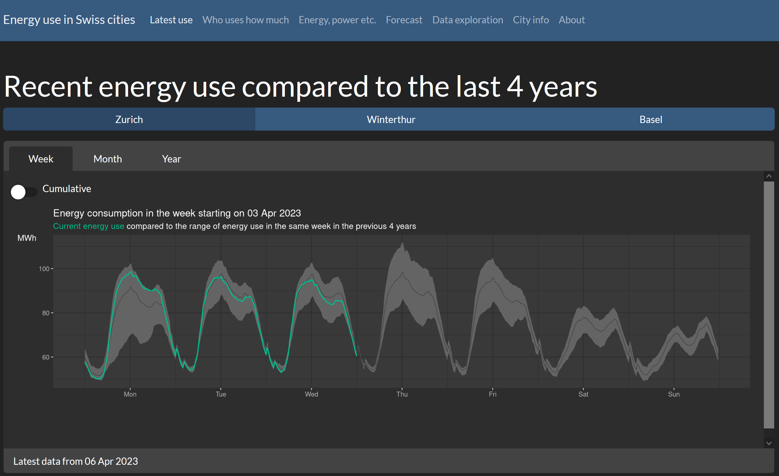
As I learnt in the exploratory phase, even with only three datasets, each showing an energy use value for every 15 minutes, there is a surprising amount of differences – the main one whether the time is given in local time or in UTC. This makes a big difference for calculating correct daily averages!
On a slightly more technical note, I was very pleased how easy it is to style the app with the bslib package, and extending the styling to the plots with the thematic package was a breeze. However, this does not work so easily (yet?) with interactive plots, which is why the app’s graphics are static. I also learnt some things about the differences between energy and power, and managed to sneak in a map as well. Thanks to the instructors of the EPFL course, I learnt lots that I now apply every day!
I had the pleasure to talk about the shiny apps I developed for this course as well as the apps we develop at Statistik Stadt Zürich at an open data beer. Thanks Laure for the invitation!