As I’ve started a course a couple of months ago on data visualisation, which is all in R, I’ve recently come across the R community’s #TidyTuesdays. If you haven’t worked with the programming language R, then you probably did not get the meaning of the last sentence – that’s fine, I was there not too long ago! So R is a programming language which is used heavily in (bio)statistics, but it’s also popular for data analysis and in particular for data visualisation. Coming from python (another programming language, this one sneakily named after Monty Python), I still think python is the more versatile, universally usable programming language, but I appreciate the ease with which you can produce pretty visualisations in R, making use of the grammar of graphics, as it is implemented in Hadley Wickham’s package ggplot2.
But what about the #TidyTuesday? It turns out that these days, it’s a very friendly environment to be learning R. The #TidyTuesday apparently grew out of an online community for learning R, the R for data science (or r4ds). Now, every Tuesday, a clean (tidy, though there is a bit more to tidy than just meaning clean in R) dataset is shared on github and twitter, and everyone is invited to visualise it in some way. Results are then shared on twitter. It’s really cool and properly inspiring to see what other people make of these datasets!
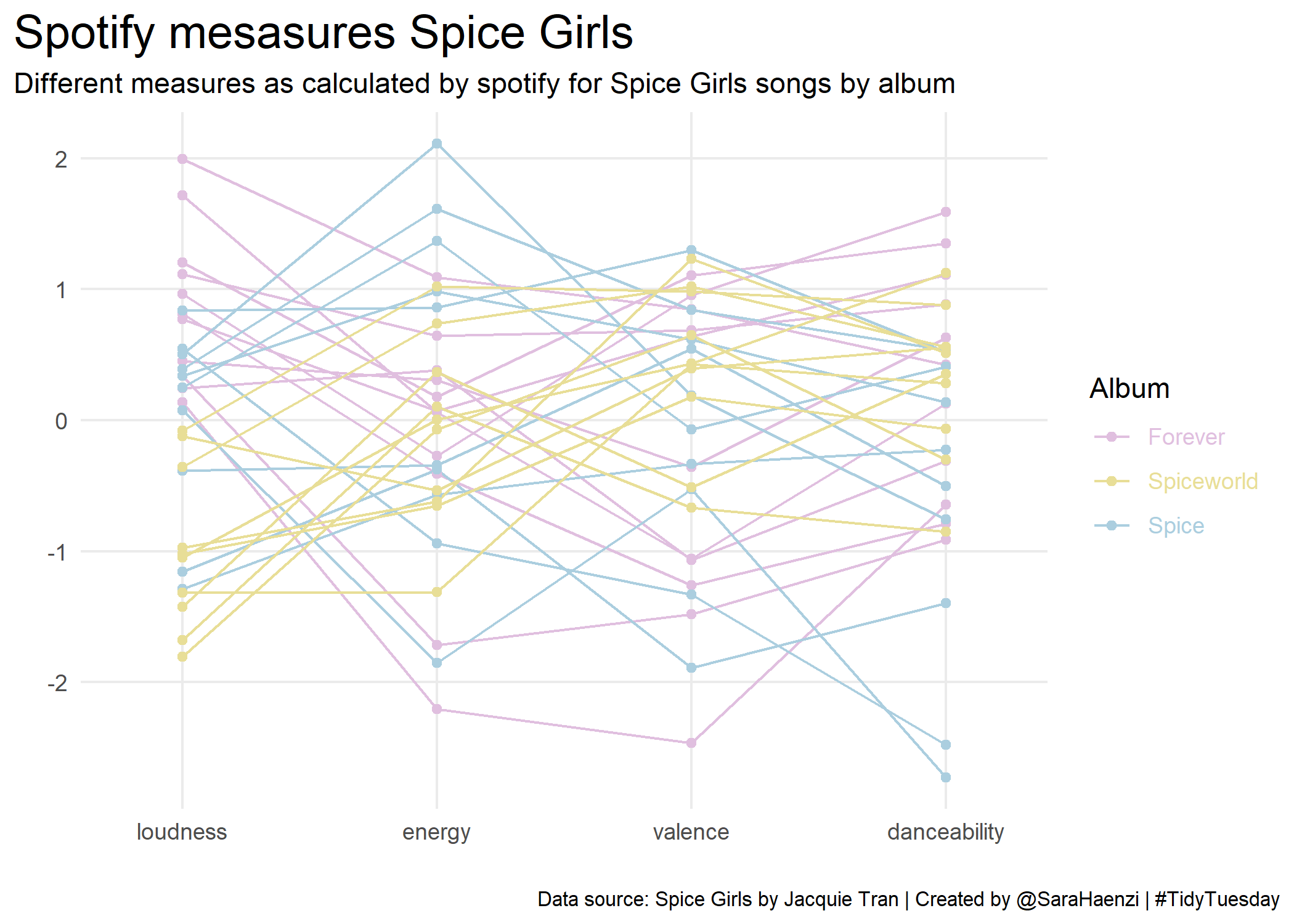
So very briefly I’ll show you my two first #TidyTuesday plots: The first is from December 2021, plotting something from Jacquie Tran‘s dataset on the Spice Girls. It contains data from spotify (among other things), including some of the metrics that spotify calculates for each song. I plotted some of these metrics, wondering what in the music they are about – however, as I know nothing about the Spice Girls, I couldn’t deduce anything about the metrics either. Anyway, here’s the visualisation:
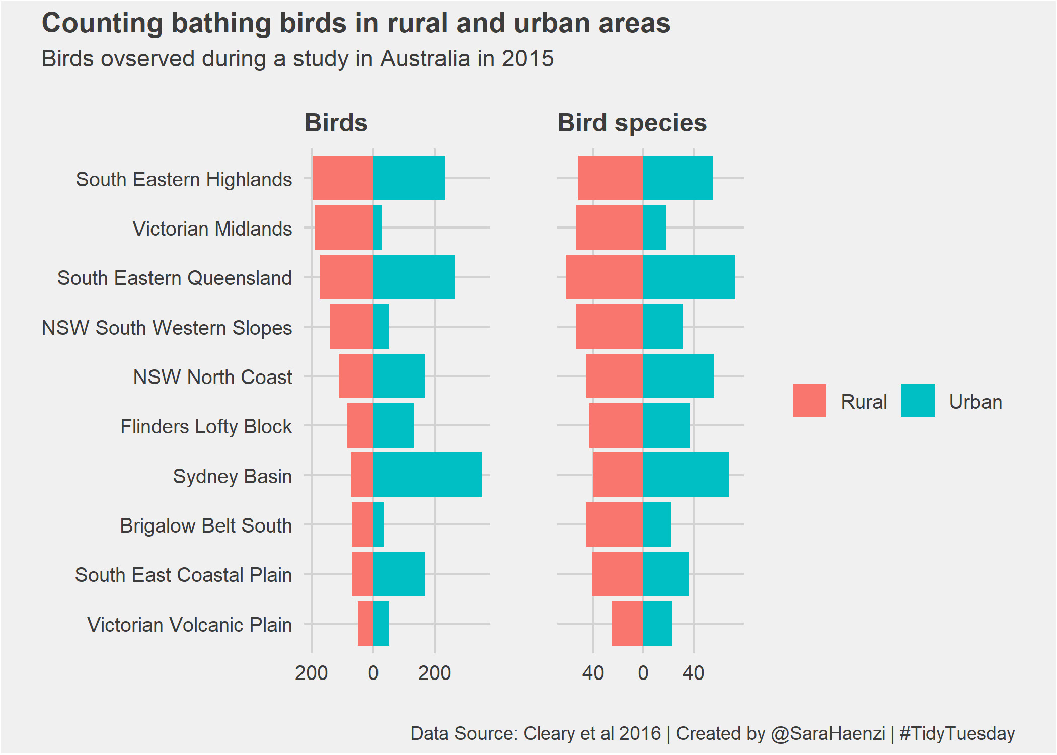
And for the second one I plotted data that was shared on a Tuesday last August, on how many birds have been observed at Australian bird baths in people’s backyard. The data of course came from a study, based on a citizen science project, which compared which birds where seen at which kind of sites, mainly comparing urban and rural. Here’s what I plotted:
While I doubt I can keep up with making a plot every Tuesday, I will definitely follow what other people do and sometimes throw in a plot of my own. Thanks to the R community for organising this, it’s a lot of fun, and an excellent way to learn!